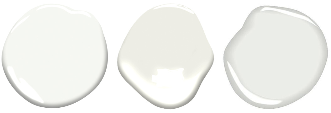
On October 7, 2015, the Benjamin Moore Company jumped the gun a bit and announced Color no. OC-117 named “Simply White” as its 2016 Color-of-the-Year. The press release described “White as a timeless and versatile design statement,” and that “The color white is transcendent, powerful and polarizing – it is either taken for granted or obsessed over.” Ellen O’Neill, Benjamin Moore’s Creative Director added “White is not just a design trend, it is a design essential. The popularity of white, the necessity of white, the mystique of white is quantifiable in our history.” I can’t imagine how Benjamin Moore went about quantifying the mystique of white; perhaps, they substituted sales data for more ephemeral criteria. We can readily, however, quantify obsession. Benjamin Moore offers over 150 individual white and off-white colors from which to choose, a staggering number for sure.
After the announcement, a blogosphere debate raged between design purists who embraced the ubiquity and essential nature of white, and color advocates who insisted Benjamin Moore had selected no color at all as its color-of-the-year. Perhaps, this fight might have been avoided with the selection of a similar color (no-color) with a more colorful name; something like OC-65 Chantilly Lace – described in the BM catalogue as “delicate and refined as the lace it was named after, this crisp, clean white evokes images of pure silk, soft linen and simpler times.” Recognizing that Chantilly Lace is almost indistinguishable from Simply White, one assumes Benjamin Moore knew exactly what they were doing in celebrating Simply White as its color-of-the-year. The marketing team must have been ecstatic at kicking off this emperor’s-new-clothes conversation and to cleaving the design world into camps, until as fate would have it, an unintended backlash occurred. Was the designation of “Simply White” a racial slur as insisted by some? Promoting the name “Simply White” simply did not play in all corners of Benjamin Moore’s market. Perhaps not quite as bad as Chevrolet marketing the Nova in Spain (translation: “no-go”), but both campaigns demonstrate the consequences of certain product names that trigger unanticipated community reaction.
As residential designers, we discuss paint a great deal, tweaking and fine-tuning our attitudes and perspectives about aesthetics and economics. Invariably, our clients feel paint and preparation costs are exorbitant, while on the other hand, painting subcontractors find their labor costs threaten profitability. While oppositional, both assessments can be simultaneously true, not unlike the assertion that white paint can be both taken for granted and obsessed over. Of all of the construction trades, painting costs are distinguished by being predominantly labor, and surprising to some, the labor expenses are mostly accrued in unseen preparation. To achieve a first quality high-end paint job, wall surfaces need more than just tape and spackle. They require proper skim-coating whereby a coat of plaster is applied to the wall surface, fully sanded, and then the process is repeated – many times over. A level-five skim coat calls for this labor-intensive process to be repeated a minimum of five times until the walls are glass-smooth. During the final stages of a project, the jobsite air becomes saturated with fine white dust particles and laborers emerge at the end of the day as if they have been coated head-to-toe in confectioner’s sugar.
Project economics dovetail with individual aesthetic programs, pretty much without exception. Specialty paint effects, which require particular preparation and additional coats of paint, drive up costs. Additionally, certain boutique paint brands have attracted market share – most popularly, Farrow and Ball (F&B) from England. In contrast to Benjamin Moore, F&B offers a limited, constantly curated selection of 132 colours. The so-very-British spelling encourages F&B acolytes to speak with a British lilt, and the brand mystique is reinforced by the “intriguing story behind each colour name.” The brand has established its reputation not only for its proprietary and curated colours and exquisite marketing, but also for the quality of its paint, and adherents claim F&B paints offer a greater ‘depth of color’ than competitor offerings. When New York City painters first began using Farrow and Ball, the expectation was that the formulations would be far superior and that the paint would lay-up and cover better than the domestic competition. While this may be true in the hands of painters experienced with the product, others have found the opposite, and now charge a premium for the higher cost of the paint and for the additional coats required to achieve the desired finish. Even with the premium cost, we have had few clients left dissatisfied by the finished product. The brand has found a niche, and has also attained fame in popular culture showcased by Saturday Night Live’s recent parody (Nov. 2, 2019). Paint, which has historically been specified by designers, picked by painters, or purchased by homeowners at Home Depot or their local paint store, has now become a status symbol. While Benjamin Moore offers more than 150 whites and off-whites and an estimated 3500 total colors, Farrow and Ball’s total color line stands at 132 colours, retiring colours when new colours are introduced. Color wars are no longer the realm of sleep-away camps and street gangs.
In practice, the color wars have more to do with culture than color. As designers and architects, we seek out the very best in all things, including paint finishes and are often outspoken in our support of custom processes and boutique brands. Many of us loudly beat the drum for Farrow and Ball (and others), gushing over the attainable subtlety and depth of colour. I am glad these options exist, and when we work with boutique paints and specialty finishes, we are invariably pleased with the results, in spite of the expense. If I were to poll our team, I think we would find some of us on both sides of this culture war. I always tread carefully, enthusiastically embracing client desires as well as those of our team, even when my personal choices differ.
For my purposes, I have adopted the Henry Ford Model T approach to interior paint. I prefer any color, as long as it’s white. I also preach that I would rather spend my money on art than on painting the walls. Why spend exorbitant sums on preparation and paint when the hope is to cover them in art? While I am glad the patrons of Michelangelo and Tinteretto felt otherwise, I prefer my art to be portable, and not to be permanently fused with the walls. Following the premise of the Paradox of Choice (Barry Schwartz, Harper Perennial, 2004), I believe Benjamin Moore could significantly reduce it’s white and off-white offerings and that aesthetic opportunities would not be compromised, even though we picked one for our Studio Program as our ‘proprietary’ color (OC-59 Vanilla Milkshake). We came across Vanilla Milkshake when trying to precisely match the color of naked plaster (joint compound) used in the skim coating process. Of all the Benjamin Moore whites and off-whites, Vanilla Milkshake has no discernable hue, not yellow, green, blue or pink, nor does not it look like an overly brilliant ‘art studio’ white.
And so, when it came time to paint the walls inside my Connecticut home, I joked with my painter that I just wanted white, and not a color named “Simply White,” or “Chantilly Lace,” or “Super White;” or even “Just White.” After this Abbott and Costello routine and after doing a little research, I found to my surprise that Benjamin Moore actually offers a color named “White.” What an easy pick. I now live in a “White” house, and in a “White” apartment, baffling people who might expect my chosen color of white to come with a romantic moniker or at least modifiers. “Wait, What,… White?” sounds a lot like “Who’s on First?”